GarBo
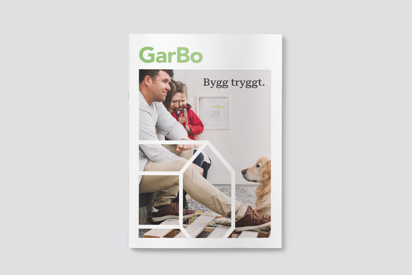
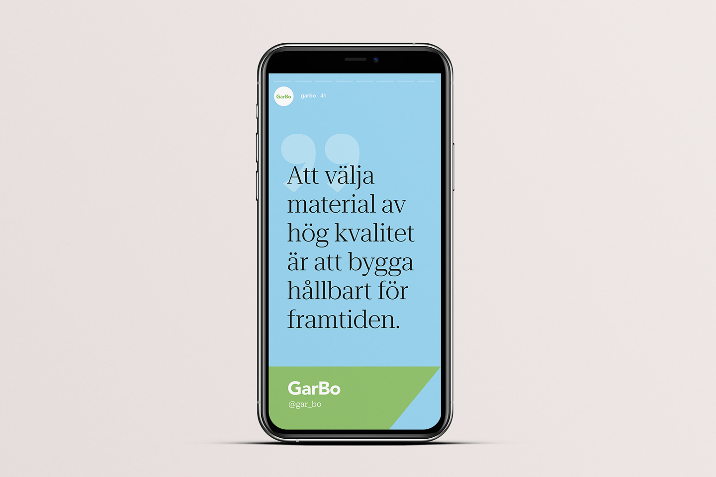
GarBo is Sweden’s market leading insurance company towards the construction industry. Their brand new identity was designed in order to communicate their vision of a safe and sustainable future – with a knowledge based and human approach.
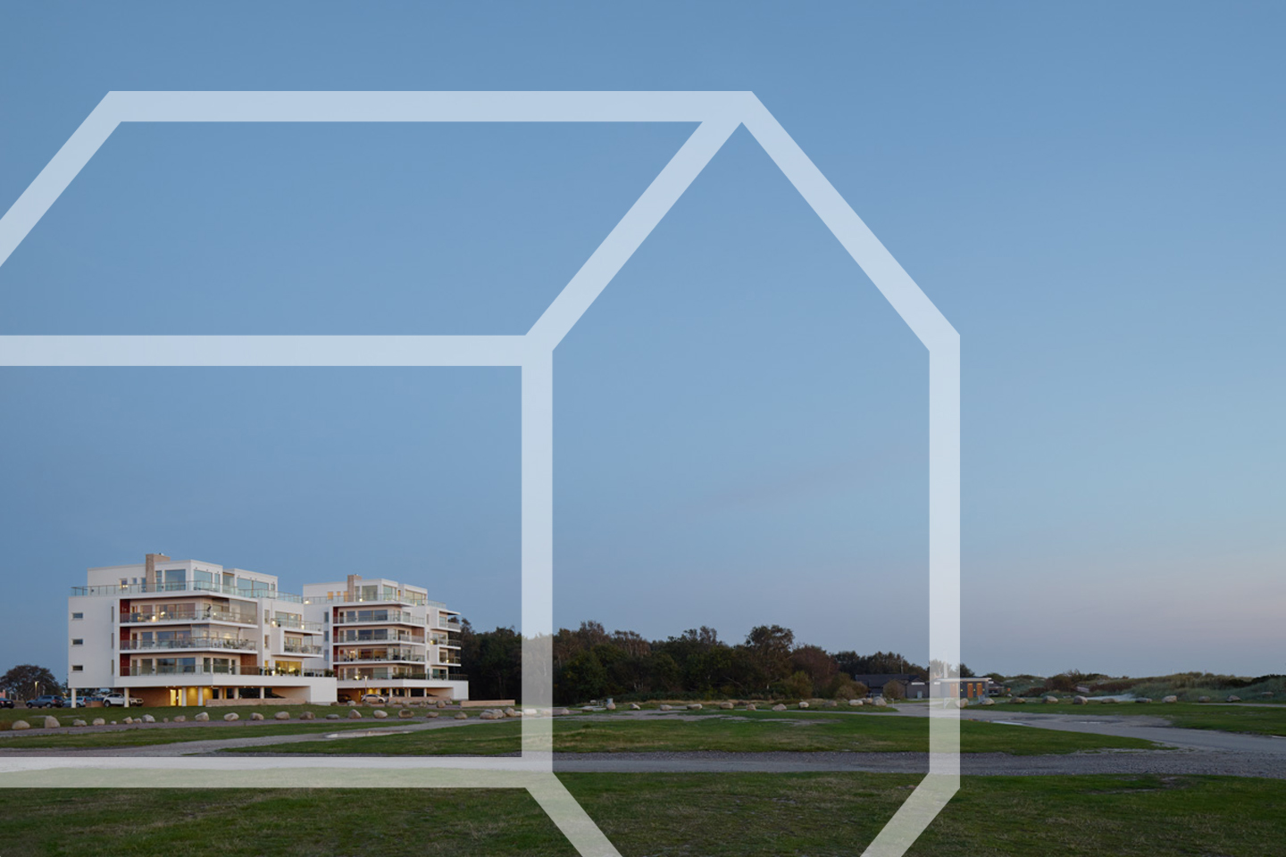
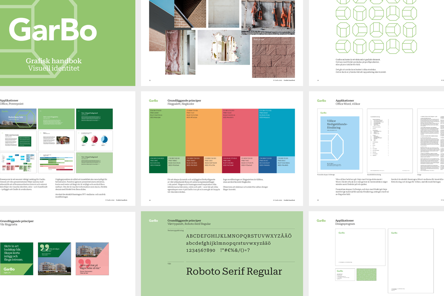
The new logotype has been given a more geometric feel, but still human. It is accompanied with a graphic element: The balanced building, that shelter everything that GarBo stands for.
The color palette is generous, and helps to communicate complexity in a pedagogical manner. Last but not least, the typography was adapted to the digital transformation of GarBo.
Date
2 augusti, 2020


